Postmodern architecture is a style of architecture that emerged in the late 1960s in response to modernism.
The architect and architecture theorist Robert Venturi wrote a doctrine for movement in his 1966 book Complexity and Contradiction in Architecture. Taking a more experimental and hybrid approach to architecture, the style flourished in the 80s and 90s, and in Contradiction and Complexity in Architecture Venturi describes what he hoped for in architecture. Most of his hopes came true when the postmodernists reacted to the earlier style.
Venturi defines postmodernism as elements “hybrid instead of pure, compromising instead of crisp, more distorted than simple, ambiguous instead of articulate, perverse and impersonal, boring and interesting, conventional instead of thought, accommodating instead of exclusive, superfluous instead of” simple, rudimentary and innovative, inconsistent and ambiguous.” Venturi draws a parallel between the features of modernity and their postmodern counterparts, such as simplification and complexity, exclusivity and tension, unity and disordered vitality doctrines of modernity, Venturi suggests adding historical elements, unusual materials, and fragmentations and modulations use and emphasize the facade. In other words, postmodernism represents new ways of thinking about buildings
Although critics of postmodern architecture have labeled them “ugly” and “flat”, it’s hard to ignore the impact the resulting buildings have on many gray landscapes.
Some architects and designers felt that the increasing number of modern buildings undermined the character of a city. They believed that this international style often replaced the architecture that was part of the local heritage and culture. Many others just found it boring. This advance against boredom is particularly evident in the works of renowned postmodernists such as Robert Venturi, Denise Scott Brown, and Steve Izenour. Venturi once said “less is bore” in response to Ludwig Mies Van der Rohe’s famous “less is more”.
Also Read, Telosa- An Upcoming $400 billion Utopian city in the American Deserts
Postmodern Architecture Characteristics
Contradiction
In direct response to the suffocating techniques of modern design – including simplified design and geometric shapes – postmodernism was a contradiction of all movements that existed before – drawing inspiration from a variety of cultures and design elements to allow for unprecedented works create ahead.
Asymmetry
Asymmetry has been a mainstay of the postmodern movement due to its ability to grab attention and create unique buildings that stand out. Inclined columns, walls, and contrasting structures were commonplace in postmodern works, offering a new perspective on what it meant to be a functional building. The juxtaposition of these angles and lines captivated the audience and helped establish postmodernism as a movement to watch.
Humor
Humor and camp, an ironic movement of gaudy art perceived to be beautiful, have been used interchangeably throughout postmodernism, particularly in the United States. And while the postmodern movement began as a rebellion against the rigidity of modernity, postmodern camp work took the rebellion to a new level.
Fragmentation
Postmodern architects were known for creating fragmented buildings that, while connected as a single building, took on the appearance of several different buildings with different functions. The Guggenheim Museum in Bilbao embodies this, because titanium, the medium used for this work, changes its color depending on the ambient light. This helped breathe new life into the building depending on the time of day and created a completely different aesthetic in daylight and evening.
Unique Materials
The postmodernists were limitless in their range of materials and applications. Postmodernist Frank Gehry is known for his unusually folded metal sheets. Although he did not express the ideals of style as much, he is known for using traditional materials in unusual ways and for using unexpected and unique materials for architectural applications.
Bright Colors
Also Read, Biomimetics in Architecture and Design
Part of the playfulness of postmodernism lies in the bright colors that adorn these buildings. Modernists often design white and glass boxes that fit any place and person. Rather, the postmodernists used color to add vibrancy and variety to their work and to turn their buildings into unique experiences designed specifically for the cities in which they were built.
Postmodern Architecture Examples
Vanna Venturi House, Pennsylvania, USA

The house designed by Robert Venturi for his mother Vanna Venturi is the earliest example of postmodern architecture. Venturi designed and built the house from 1962 to 1964. Venturi went through six versions of the design before finally settling on the house design scheme. Located on flat land, surrounded by trees. The main features of the house included a pitched roof as opposed to a flat roof, a closed ground floor as opposed to an open floor plan, and a purely ornamental arch over the front door.
Walt Disney Music Hall, Los Angeles, California

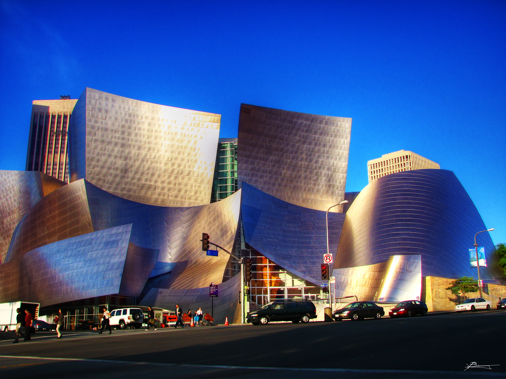
The Walt Disney Concert Hall is home to the Los Angeles Philharmonic Orchestra and the Los Angeles Master Chorale and is inspired by the architect’s love for sailing. Organic shapes are said to resemble floating sails frozen in time.
The massive building – and its many metal sails – is clad with over 12,000 stainless steel panels that cover an area of over 79 kilometers. In addition to its truly unique design aesthetic, the building is also known for its acoustics. Acoustic designer Yasuhisa Toyota was brought into the plan to design the concert areas of the hall in such a way that they perfectly process the sound while designing curved interiors that match the unusual metal skin of the building.
The Portland Building, Portland, USA

The Portland Municipal Services Building is one of the most popular examples of postmodern architecture. It was designed by Michael Graves after a design competition where Portland Mayor Frank Ivancie called for a postmodern design. He believed that the modernists made the city centers “boring” and that this new project should become a distinctive building for the city.
The colors and the geometric shapes of the facade are playful and bright. This building does not follow any established rules of universal design but has its own character that makes it a recognizable and obvious addition to the horizon. The triangular facade breaks the rule of “form follows function”, as it is neither tied to the program nor to the internal function of the building. The exterior design is there because it’s fun and that’s enough for post-modernists!
MI6 building, London, UK

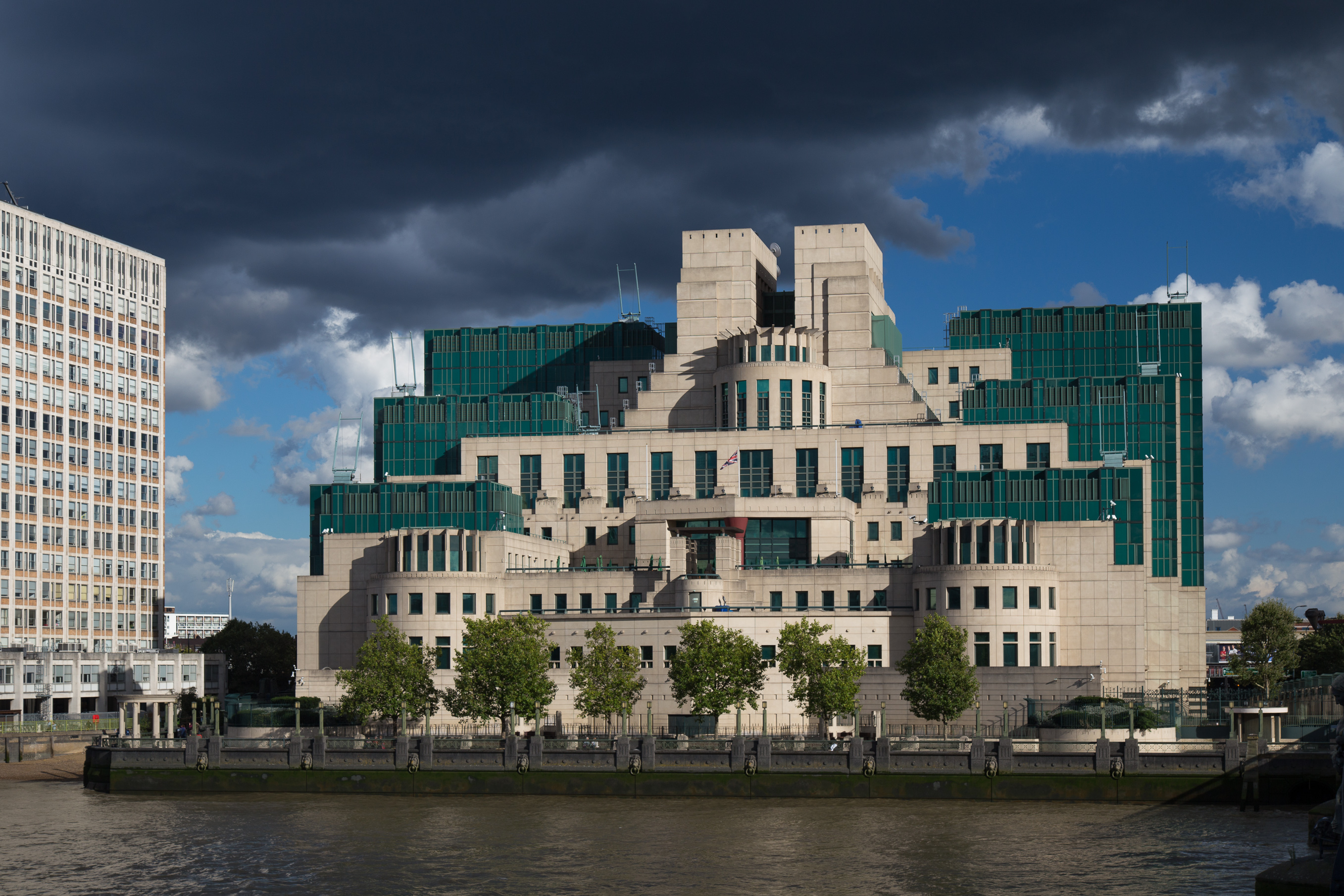
The SIS or MI6 building has housed the United Kingdom’s Secret Service since 1994. Terry Farell designed the building in the late 1980s, and the architecture is influenced by industrial architectures such as power plants and Aztec or Mayan temples. Contradicting influences have come together in a single structure.
Piazza D’italia, New Orleans

Piazza d’Italia is a playful take on the traditional Italian piazza in New Orleans, Louisiana. It was designed by Charles Moore with Perez Architects as an example of Moore’s belief in inclusive architecture that is open and accessible to all. When the modernists tried to find a universal architectural language that could be used anywhere, the Piazza d’Italia was designed to be relevant to the location and to act as a monument to the city’s Italian influence.
Some postmodernists have used the classic icons of columns and arcades to mock the modernists, but Moore took a less cynical approach. Its classic architecture in bright colors was a true celebration of Italian innovation in architecture. Such a bold design would surely generate mixed opinions. Some people questioned the project because of its design alone, but many others agreed that it failed when developments nearby failed and turned Piazza d’Italia into “postmodern ruin”. The project was eventually restored and has a much better reputation in general today. Love it or hate it, Piazza d’Italia is sure to be a unique and fun public space.
Join Our Whatsapp Group for the latest updates -Click Here
Join Our Telegram Channel for the latest updates -Click Here
References
2. https://mymodernmet.com/post-modern-architecture/
Comments are closed.